REFRACT
Photography Analysis & Enhancement
IMG_0223_Original.jpeg
Multi-LLM Analysis
Consensus Score
Original Review
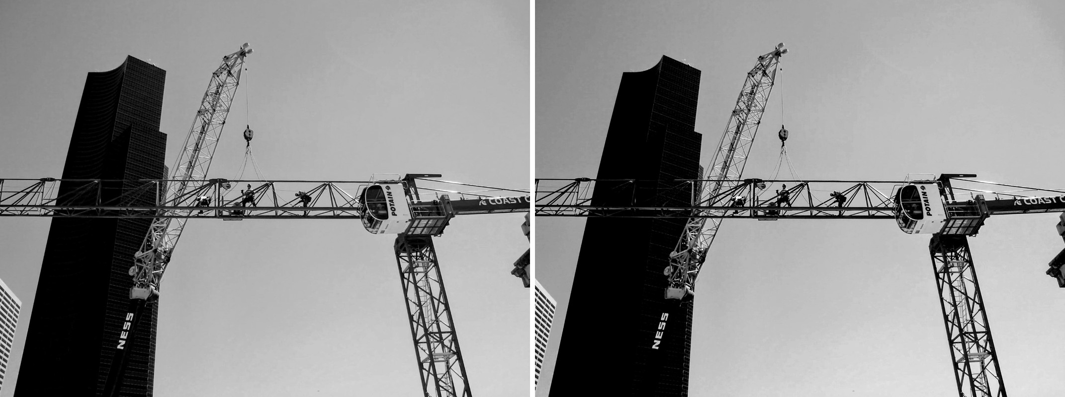
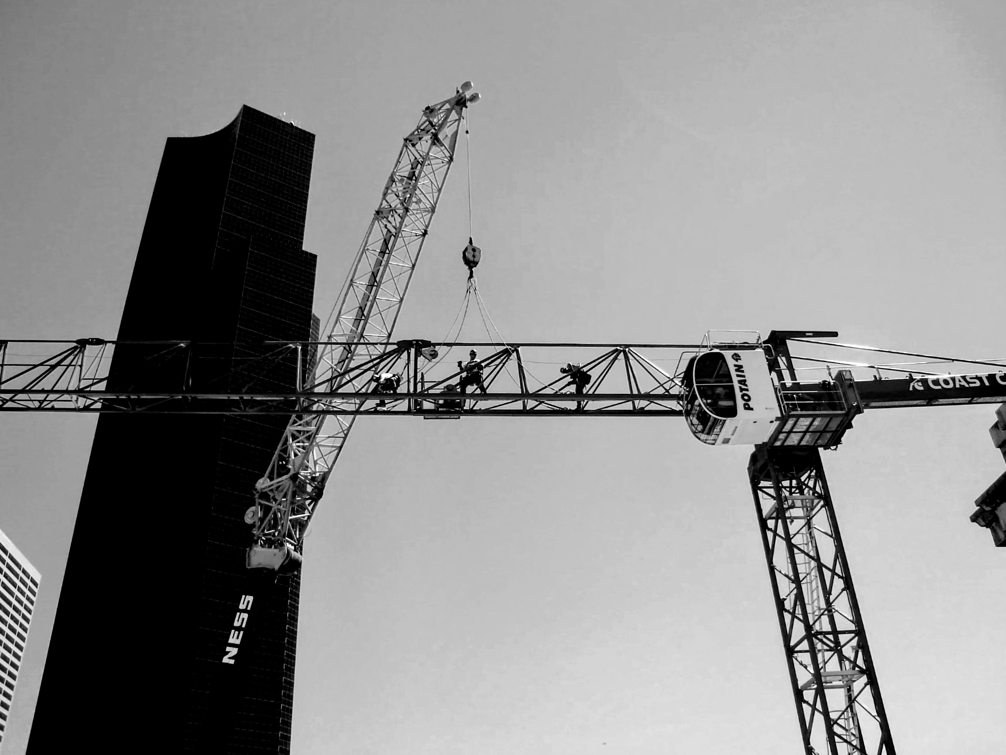
The image features strong geometric lines and industrial subject matter, but the exposure is unbalanced with the background building losing all detail. Recovering the shadows and cleaning up the edges through cropping will create a much more cohesive composition.
- Lift shadows by approximately 20-30% to recover texture in the dark skyscraper on the left which is currently crushed to black
- Crop the bottom left corner to remove the distracting fragment of the white grid-patterned building
- Increase local contrast or clarity by +15 to accentuate the rivets and truss structure of the cranes
Analysis failed: Error code: 400 - {'error': {'message': "Unsupported parameter: 'max_tokens' is not supported with this model. Use 'max_completion_tokens' instead.", 'type': 'invalid_request_error', 'param': 'max_tokens', 'code': 'unsupported_parameter'}}
Strong industrial composition with good geometric interplay between the building and crane. The image effectively captures urban construction but lacks tonal separation between elements. The flat gray sky and similar midtone values throughout reduce visual impact. Enhanced contrast and selective dodging would better highlight the human element and structural drama.
- Increase contrast by 15-20% to add more punch to the black and white tones and separate the crane from the sky
- Dodge the middle section of the horizontal beam by 10-15% to draw more attention to the workers
- Crop slightly tighter from the bottom to remove excess negative space and strengthen the upward diagonal composition
Combined Improvements Applied:
- Lift shadows by approximately 20-30% to recover texture in the dark skyscraper on the left which is currently crushed to black
- Crop the bottom left corner to remove the distracting fragment of the white grid-patterned building
- Increase local contrast or clarity by +15 to accentuate the rivets and truss structure of the cranes
- Apply a slight vignette to focus attention on the intersection of the cranes and the workers
- Increase contrast by 15-20% to add more punch to the black and white tones and separate the crane from the sky
- Dodge the middle section of the horizontal beam by 10-15% to draw more attention to the workers
- Crop slightly tighter from the bottom to remove excess negative space and strengthen the upward diagonal composition
- Apply a subtle vignette (10-15% opacity) to keep viewer focus on the central crane and building interaction
Before & After Comparison